Circular vs Linear Desk Light Bars: Beam Patterns
10th May•12 min read
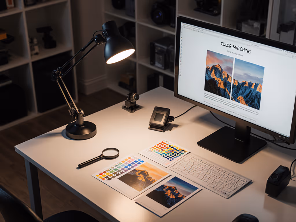
When you're editing photos at your desk, the lighting around your workspace becomes part of your color-grading chain. A photographer desk lighting comparison focused on color-managed workspace lighting isn't just about brightness, it's about consistency. What looks balanced on your screen needs to match what prints on paper, and that chain begins where your eyes meet the work surface.
This guide maps the key approaches to desk lighting for photo professionals, translating metrics into choices you can trust.
Print-to-screen color matching lives at the intersection of three systems: your monitor profile, your image file, and your surrounding light. Most photographers obsess over the first two and overlook the third, then wonder why their prints look warmer, cooler, or flatter than expected.
The problem: your eyes adapt instantly to the ambient light in your workspace. If that light is too warm, your monitor's color will feel cool by comparison, and you'll unconsciously push it cooler. Print it, and the result skews blue. Reverse it with overly cool desk light, and your prints become muddy and warm.
Beyond adaptation, there's a practical layer. Color-accurate lighting workflows demand that you see true blacks, true whites, and mid-tone neutrals without distortion. A cheap LED with poor red rendering (low R9) will hide warm details; a dim, flickering light will make you strain, forcing your eyes to dilate and further distort color perception.
The core principle is straightforward: stable, neutral, high-CRI light at your desk removes one variable from the equation, so your eyes and brain can focus on what matters, matching screen to print.
Photographers often hear terms like lux, CRI, and color temperature and then glaze over. Here's what each actually tells you, in plain language. For a comprehensive primer, read our desk lamp specs guide.
Lux is how much light actually reaches your work surface, measured at a specific distance. Most lamp specs quote lux at one meter away from the lamp, often unrealistically far. What matters is lux at your desk, typically 24 to 36 inches away.
For detailed professional photo editing lighting, aim for 500 to 750 lux across your main editing zone. That's bright enough to see fine tonal shifts without forcing you to squint. Below 300 lux and you'll oversaturate colors and miss shadow detail. Above 1,000 lux and you're working in a showroom, which fatigues quickly and distorts warm/cool judgment.
The practical test: if you need to strain to see a pencil's shadow on white paper at your typical working distance, your light is too dim.
CRI (Color Rendering Index) rates how faithfully a light source renders a standard set of test colors, on a scale of 0–100. A CRI of 80–89 is acceptable for general work; 90+ is professional-grade; 95+ is excellent.
But CRI is an average. The real tell for photographers is R9, the individual score for saturated red. Many LEDs (especially cheap task lights and overhead fixtures) score well on CRI overall but fail on R9, often below 50. The result: reds look muted or muddy on your screen, so you compensate by oversaturating them in post, and prints come out garish.
Demand CRI 90+ and explicitly check R9 ≥ 80. Your reds will sing.
Color temperature, measured in Kelvin (K), describes whether light feels warm (lower: 2700K) or cool (higher: 6500K). Neutral daylight is around 5500K; studio standards often target 5000 to 5500K. The catch: many desk lights shift color temperature as you dim them. At full brightness they're 5500K and neutral; dial them down and they drift toward yellow (3000K), which again distorts your color judgment.
For professional photo editing, stability across dimming is non-negotiable. Seek lamps that maintain color temperature ± 300K across the entire dimming range. For task-specific CCT targets, use our Kelvin guide.
High-frequency flicker (imperceptible but present in many LEDs) causes eye strain, headaches, and can introduce banding into video or long-exposure photography. Lamps with RGB lighting calibration-grade power supplies typically flicker at 20+ kHz, rendering it invisible.
Low-cost PWM (Pulse Width Modulation) dimming can flicker at 100 to 500 Hz, which your eyes feel even if they don't "see" it. Test: dim the lamp while looking at it on your phone's slow-motion camera. If you see banding, the flicker is low-frequency and problematic. To understand why flicker happens and how to spot quality implementations, see our LED driver guide.
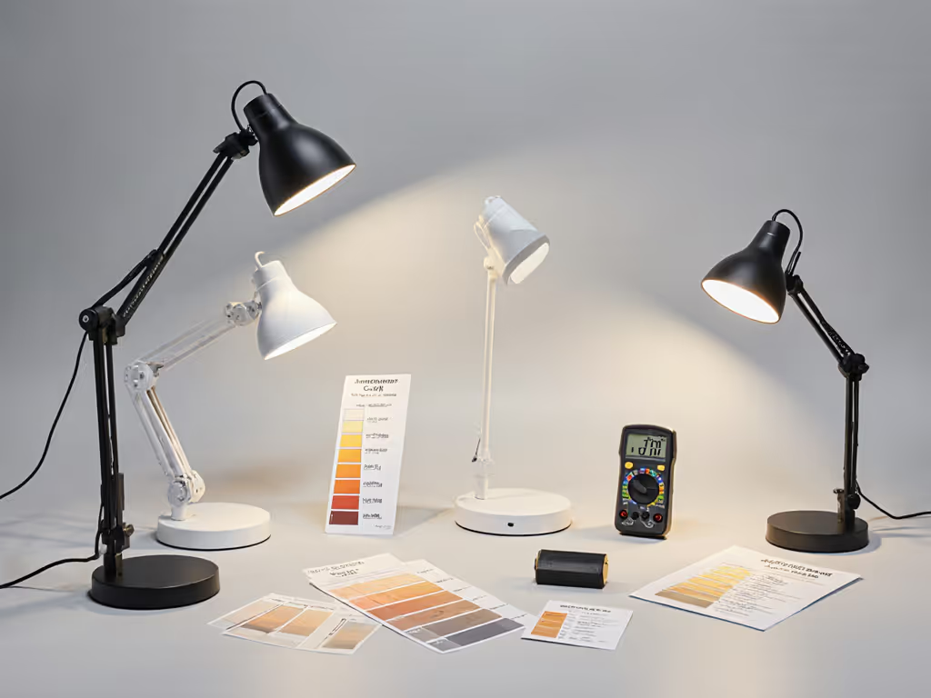
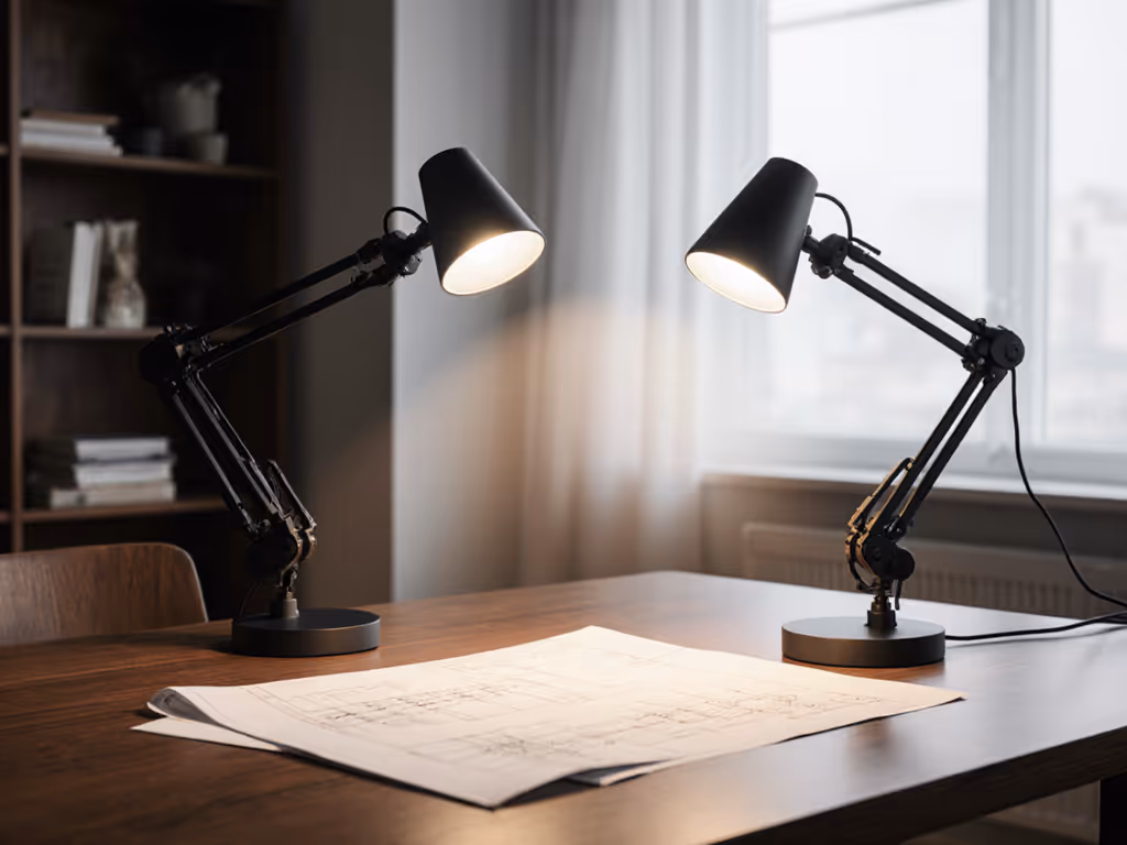
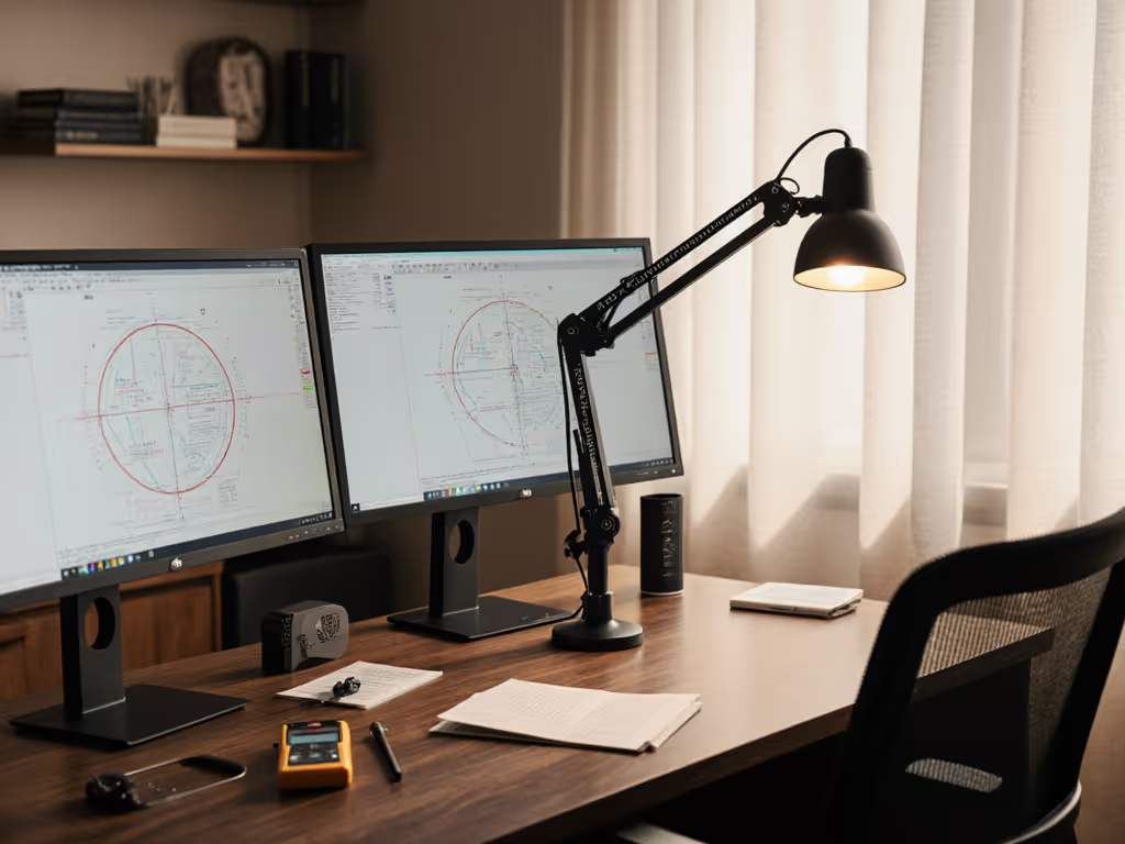
A focused desk lamp with a tight beam, like a desktop fixture with a small reflector, concentrates light directly onto your work surface, delivering high lux with minimal spillover. This approach uses compact, powerful lights that sit just off to the side of your workspace.
Pros:
Cons:
Best for: Small, dedicated desks; retouchers working on a single region; shops with clamp-mount flexibility.
A soft, diffused overhead or wall-mounted source (often with a large diffuser or softbox) provides even, shadowless fill. A second, focused task light fills in problem zones or adds accent where detail work happens.
Pros:
Cons:
Best for: Larger desks or studios; teams sharing space; dual-monitor setups where you need to avoid screen spill. For placement and beam control around multiple displays, follow our dual monitor lighting guide.
Position your desk near a window and use an artificial task light to supplement or balance natural daylight. Natural light is free and has excellent CRI, but it varies throughout the day and can't be dialed down.
Pros:
Cons:
Best for: Home studios with good window light; freelancers with flexible schedules; supplementary boost during winter afternoons.
Start simple: map your workstyle, then dial lux and CCT.
Here's the practical approach.
Ask yourself:
Measure the usable work zone (typically 24 to 36 inches away from where you sit). Note obstacles: monitor arms, tall monitors, shelves. Identify glare points, spots where screen reflections are worst.
Non-negotiables:
Place the lamp, sit at your normal working position, and take a test print. Compare it to your monitor. If the print looks too warm, your ambient light may be pulling cool; dial the monitor cooler slightly, print again, and iterate. This is where frameworks turn into muscle memory. I've watched this work: a friend worried her editing was off, so we taped a test grid and checked actual illuminance at her desk using a phone sensor app. Turns out her light was 200 lux dimmer than spec claimed. One adjustment, and her edits matched prints immediately.
Spill onto the monitor. Many desk lamps light the desk but create a light source visible in glossy monitor reflections. Use asymmetrical beam patterns or barn doors (grid attachments) to steer light away from screen edges.
Insufficient reach. Arm joints that sag or won't lock at the angle you need defeat the purpose. Test the lamp under load at the angle you'll use it. Look for models with locking friction joints or motorized positioning.
Overly aggressive dimming. Some LEDs can't go below 10% brightness without flickering, humming, or color-shifting unpredictably. Confirm minimum brightness specs and practical performance.
Thermal creep. Cheap LEDs degrade in brightness or color after months of continuous use. Ask about L70 ratings (how long before brightness drops to 70% of initial); aim for 50,000+ hours for desk work.
Cable chaos. A great light with a 3-foot cable running across your desk defeats the minimalist ideal. Check cable length and routing options (under-desk clips, grommet mounts) before buying.
The goal isn't perfection, it's consistency. Once your desk lighting is stable, predictable, and matched to your workflow, your editing improves almost immediately. Colors are clearer, decisions faster, and prints match screen.
The framework here removes guesswork: map your desk, understand your metrics, choose an approach that fits your space, and iterate. You'll land on the right combination, and unlike a camera body, a desk light pays dividends every single working day for years.
Start by measuring your current desk illuminance with a free lux meter app (yes, your phone can do this). Compare it to 500 to 750 lux. If you're below 300, you have your answer. If you're above 1,000 with cool, high-CRI light and you're still unhappy, the problem is elsewhere (likely your monitor profile or a processing habit). Knowing that is clarity too. Explore your specific desk constraints next: measure your work zone, identify glare points, and test whether a single focused light or a two-source setup better suits your editing routine. The data will guide you.